What Is an Anchor Chart? (And How to Make One That Actually Lasts)

A plain-language explainer for teachers, coaches and new hires — what an anchor chart is, what makes one work, real examples by subject and grade, and why more schools are printing them instead of hand-drawing a new set every single year.
Quick Answer
An anchor chart is a classroom poster that captures one specific skill, process, or piece of vocabulary — usually in students’ own words and visuals — so the class can refer back to it long after the lesson that created it is over. Anchor charts are traditionally hand-drawn on chart paper during a lesson, but they don’t have to stay that way: a growing number of schools build them once in StudioCore’s Smart Tools and print them at true poster size, so the chart stays sharp, legible from across the room, and easy to reprint identically for every classroom on a grade level.
The Basics
What Is an Anchor Chart in Education?
In education, an anchor chart is a visual reference — almost always a large poster — that “anchors” new learning to something students can see and return to. Instead of a skill living only in a lesson that happened once, it lives on the wall: the steps for solving a word problem, the sounds a letter combination makes, the classroom’s agreed-on norms for a discussion, the stages of the water cycle. The chart usually gets built with the class rather than handed to them finished, which is a big part of why they work — students see their own thinking, in language they used, turned into something permanent.
Anchor charts are a staple from kindergarten through middle school and show up constantly in reading, math, writing, science and SEL/behavior instruction. They’re closely related to word walls and vocabulary walls, but an anchor chart is usually built around one specific concept or strategy rather than an ongoing running list.
Before You Build One
5 Things a Good Anchor Chart Does
Teaches one idea, not five
A chart crammed with every rule a class has ever learned stops working as a quick reference. The strongest charts commit to a single skill or strategy.
Uses consistent color-coding
Students learn the code fast — blue for nouns, red for verbs, a repeated icon for “check your work” — and that consistency is what makes a chart scannable at a glance.
Reads from across the room
A chart that only works up close isn’t doing its job. Bold headers and real contrast matter more than fitting in extra detail.
Gets built with students
Charts made live, using the class’s own examples and wording, stick with students far better than one that arrived pre-made and was simply taped to the wall.
Gets referenced, not just displayed
The best charts get pointed to constantly — “check the chart” — for weeks or months, not put up once and forgotten by Friday.
Real Examples
Anchor Chart Ideas by Subject & Grade
Anchor charts look different at every grade level and in every subject, but the same handful of formats keep reappearing. Here’s the pattern by area.
Reading & ELA
K–5The most common anchor-chart subject by far. Reading-strategy charts (“Just Right Books,” “Making Predictions,” the “CSI: Comprehension Strategies” family), sound walls and phonics charts, opinion-writing scaffolds, and story-element charts (character, setting, problem/solution) are staples in nearly every elementary classroom.

An opinion-writing anchor chart built in StudioCore, in use during an elementary writing lesson.
Common formats
- Reading-strategy checklists with icons
- Sound walls mapping sounds to spellings
- Story-map / character-map templates
Where to see it
- Above the classroom library
- Beside the guided-reading table
Math
K–8Step-by-step problem-solving charts (“CUBES,” long division steps, order of operations), fact families, and vocabulary charts for geometry or fractions. Math charts tend to stay up the longest because students refer back to the steps all year.
Common formats
- Numbered step-by-step strategy charts
- Vocabulary charts with worked examples
Where to see it
- Above the math workshop area
- Near the whiteboard for quick pointing
Science
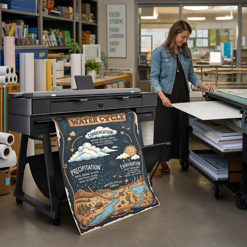
2–8Process charts — the water cycle, the scientific method, states of matter — along with vocabulary charts for a current unit. Science anchor charts often get rebuilt or swapped out unit to unit, which is exactly where a reprintable version saves the most prep time.
Common formats
- Cycle / process diagrams
- Unit vocabulary walls
Where to see it
- Rotated as units change
- Near the science station or lab table
SEL & Classroom Behavior
All GradesFeelings charts, conflict-resolution steps, classroom norms and expectations (CHAMPS-style behavior charts are a common example), and discussion-skills charts. These tend to be the most consistently referenced charts in the room because they get pointed to every single day, not just during one subject.
Common formats
- Feelings / regulation charts
- Norms & expectations charts
Where to see it
- By the classroom meeting area
- Near the door or calm-down corner
Step by Step
How Do You Make an Anchor Chart?
The classic version is built live, in front of students, during the lesson it supports:
Pick one idea
Name the single skill or concept the chart will teach — not the whole unit.
Sketch the layout first
Rough out headers, sections and where examples will go before writing on the real chart.
Build it with the class
Fill it in live using student language and examples — this is what makes it stick.
Hang it where it gets used
Post it at eye level, near where the skill actually comes up, not on a far wall.
That process still works. What’s changed is what happens after step 4: instead of taping up the hand-drawn original and hoping the marker doesn’t fade, more teachers are typing the same content into a template afterward and printing a clean, durable poster-size version — keeping the live-build lesson and ending up with a chart that survives the whole year.
The Durability Problem
Why Handwritten Charts Fade — and What Schools Are Doing Instead
Chart paper is thin, marker ink fades under fluorescent light and sun exposure, corners curl and tear from being rolled and unrolled between units, and a chart that works beautifully in one room has to be redrawn from scratch for every other classroom on the grade level that wants the same one. None of that is a knock on the format — it’s just what happens to paper and marker over a school year.
Printing the chart instead solves the durability and consistency problem without giving up the parts that make anchor charts work: it can still be built from the class’s own words, still uses the same color-coded, icon-heavy layout students recognize, and still gets hung at eye level where it gets used. It just survives past October, and every teacher on the team can have the identical version.

Smart Tools Build Anchor Charts From Your Words
StudioCore — the K-12 design software Poster Studio Express bundles with its poster maker packages at no extra charge — includes 140+ Smart Tools built for exactly this kind of classroom content, anchor charts among them. Type the steps, the vocabulary, or the categories, and the Smart Tool assembles a clean, color-coded layout automatically — no blank-canvas design work required. The result stays fully editable: unlock it, rearrange a section like a sticker, lock it back in and reprint. Nothing prints without teacher approval.
Type, Don’t Design
Enter the chart’s content and the Smart Tool builds the layout, spacing and color-coding for you.
Reprint Identically
Every teacher on a grade level can print the exact same chart — no redrawing per classroom.
Stays Editable
Swap a section next unit instead of starting the whole chart over from scratch.
Side By Side
Hand-Drawn vs. Printed Anchor Charts
Neither approach is wrong — most classrooms end up using both. Here’s where each one actually wins.
| Hand-Drawn Chart Paper | Printed Poster | |
|---|---|---|
| Building it live with students | Yes — the original strength of the format | Can be typed up live and printed right after |
| Durability over a full year | Fades, curls and tears with handling | Holds color and shape through the year |
| Consistency across classrooms | Redrawn from scratch every time | Identical reprint for every room |
| Updating next unit | Start the chart over | Unlock, edit a section, reprint |
| Readable from across the room | Depends on handwriting and marker | Consistent bold type at true poster size |
| Best for | The in-the-moment building lesson itself | The version that stays on the wall all year |
Our Take
Which Approach Fits Your Classroom?
Build it live on chart paper
The in-the-moment, built-with-students version is still the strongest way to introduce a skill. Keep doing this part exactly as is.
Type it up and print it
Same content, same color-coding, printed at true poster size on an Express Series machine. It stays sharp instead of fading by winter break.
Print once, reprint per room
Build it with one class, then reprint the identical poster for every other classroom on the team — no redrawing five times.
Print Anchor Charts That Actually Last
See how Smart Tools turn typed content into a classroom-ready anchor chart, then print it at true poster size on an Express Series machine — StudioCore included, no subscription.
FAQ
Frequently Asked Questions
What is an anchor chart?
An anchor chart is a classroom poster that captures one specific skill, process or piece of vocabulary — usually in students’ own words and visuals — so the class can refer back to it after the lesson that created it is over. It “anchors” the learning to something visible instead of letting it live only in that day’s lesson.
What is an anchor chart in education?
In an education context, an anchor chart is a teaching tool: a large visual reference, typically built with students during a lesson, that displays a strategy, process or set of vocabulary the class will need to remember and reuse. It’s common from kindergarten through middle school across reading, math, science and SEL instruction.
How do you make an anchor chart?
Pick one specific skill or idea, sketch the layout before writing on the real chart, build it live with the class using their own language and examples, then hang it at eye level near where the skill will actually get used. Many teachers now also type the finished content into a template and print a durable poster-size version to keep alongside — or instead of — the hand-drawn original.
What size should an anchor chart be?
There’s no single required size — traditional chart paper varies by brand and pad. For a printed anchor chart, most classrooms use roughly 18×24″ for a single wall or easel spot, up to 24×36″ for a highly visible, whole-class reference wall. Those sizes line up with standard wide-format poster printer widths, so a chart can be scaled to fit the exact wall or bulletin board space available.
Can you print anchor charts instead of hand-drawing them?
Yes. Anchor-chart content can be typed into a template — StudioCore’s Smart Tools are built specifically for this — and printed at true poster size on a wide-format school printer. That keeps the same color-coded, icon-driven layout teachers already use, but it stays sharp and legible for the full year and can be reprinted identically for every classroom on a grade level.
Whether a chart gets built fresh on paper in front of students or typed up and printed afterward, the goal is the same: a wall reference the class actually uses, not just decoration. For the live-build lesson, keep doing exactly what already works. For the version that has to survive a full school year across every classroom on a team, printing is worth the five extra minutes. See how the same idea applies more broadly on the full poster maker buyer’s guide, or compare paper finishes on the satin vs. matte vs. glossy guide before printing a set.
Written by Dr. Maya Richardson, District Director of Curriculum & Instruction, for Poster Studio Express.
Last updated: