
Picture this: Maya, a bright third-grader with ADHD, enters her classroom Monday morning. The walls burst with neon posters, overlapping text, and busy patterns. By 9:15, she’s overwhelmed, unable to focus on her morning work. Sound familiar? As an elementary literacy coach supporting 22 schools, I’ve seen how the best poster printer for neurodiverse learning can transform chaotic visual spaces into calming, structured environments that help all students thrive.
Research from the CDC shows that 1 in 6 children has a developmental disability, with many experiencing sensory processing differences. These learners need thoughtful visual design—not visual noise. Today, I’ll share evidence-based strategies for creating sensory-smart posters that reduce cognitive load while maintaining engagement. Plus, you’ll get my downloadable template for instant implementation!
Understanding Sensory Processing in the Classroom
Before diving into design principles, let’s understand why traditional classroom visuals often fail neurodiverse learners. According to research from the Kennedy Krieger Institute, sensory processing differences affect how students perceive and respond to visual information. What seems “decorative” to neurotypical students can feel overwhelming or distracting to those with autism, ADHD, or sensory processing disorder.
The brain’s visual cortex processes approximately 10 million bits of information per second. For neurodiverse learners, filtering this information requires extra cognitive energy. When classroom walls feature high-contrast patterns, multiple fonts, or overlapping elements, students expend mental resources just managing visual input—leaving less capacity for actual learning.
This explains why Maya struggled in her visually chaotic classroom. Her brain worked overtime processing competing visual stimuli instead of focusing on academic content. The solution? Strategic visual design that supports rather than overwhelms.

The Science of Color in Neurodiverse Spaces
of autistic individuals report hypersensitivity to bright colors
show improved focus with muted color palettes
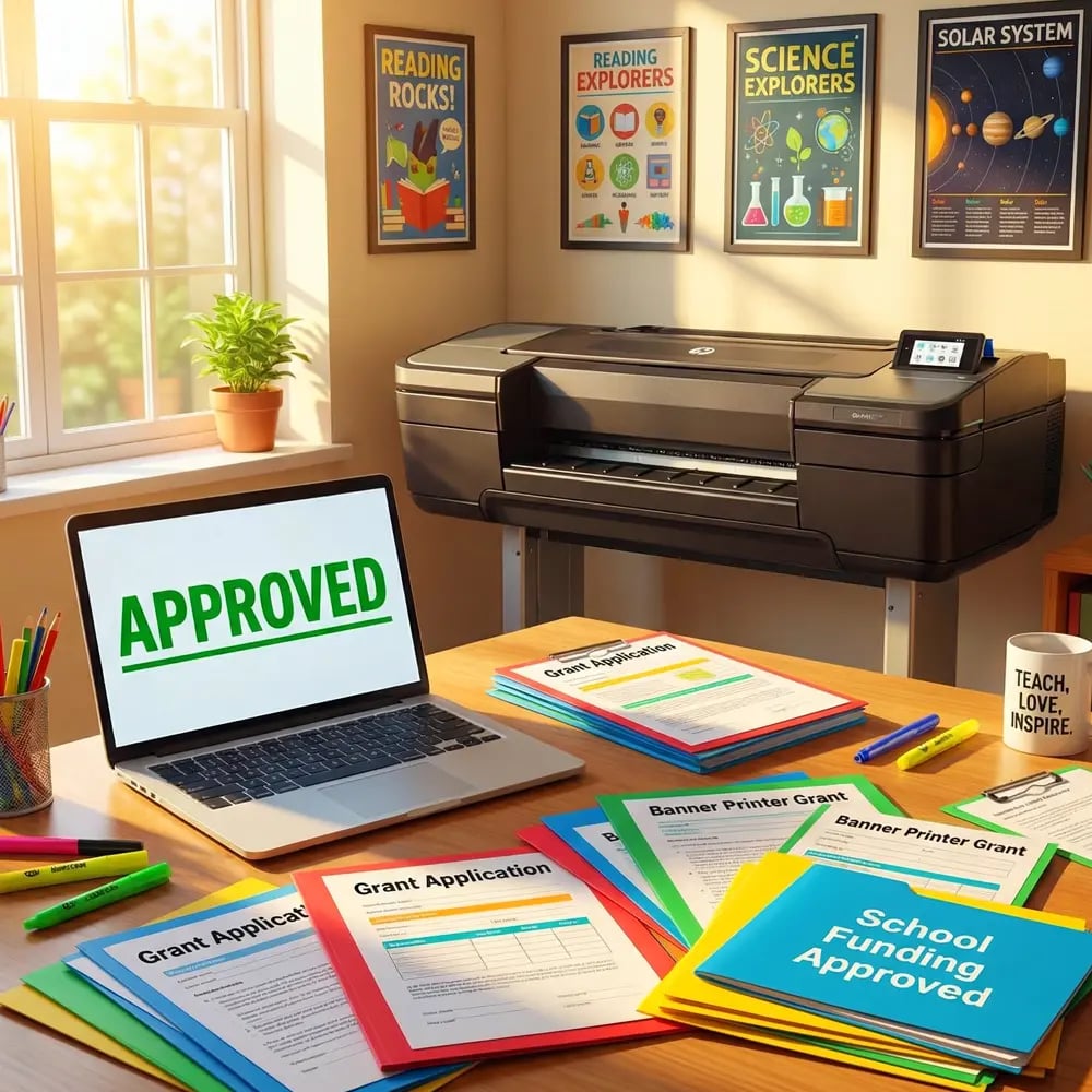
Choosing the Best Poster Printer for Neurodiverse Learning Environments
Selecting a color poster maker machine goes beyond print quality—it’s about creating materials that support all learners. Through my work with diverse classrooms, I’ve identified key features that make certain printers ideal for sensory-smart design:
1. Precise Color Control Professional-grade printers like the Education Studio 44 offer color management systems that ensure consistent, predictable output. This matters because neurodiverse learners rely on color consistency for navigation and comprehension. When your “calm blue” schedule looks different each time you print, it disrupts the visual predictability these students need.
2. Matte Finish Options Glossy posters create glare that can trigger sensory overload. Quality poster printers accommodate matte media, reducing reflections that distract sensitive learners. The lifetime design service can help you optimize layouts specifically for matte printing.
3. Large Format Capability Bigger isn’t always better, but for visual schedules and learning supports, size matters. Large-format printers allow proper spacing between elements, reducing visual clutter. Students can process information more easily when text and images have breathing room.
Five-Step Sensory-Smart Poster Design Process
Step 1: Choose a Calming Base Color Start with soft blues (hex #E3F2FD), gentle greens (#E8F5E9), or warm neutrals (#FFF8E1). These colors reduce visual stress while maintaining engagement. Avoid pure white backgrounds—they create harsh contrast that strains sensitive eyes.
Step 2: Limit Your Palette Use no more than three colors per poster. Research from the International Color Consortium shows that limited palettes improve comprehension for neurodiverse learners. Assign specific meanings: blue for schedules, green for instructions, yellow for celebrations.
Step 3: Create Visual Hierarchy Use size, not color, to indicate importance. Make primary text 3x larger than secondary information. This reduces the cognitive load of determining what to read first.

Step 4: Embrace White Space Leave 40% of your poster empty. This “visual breathing room” prevents overwhelm and helps students focus on essential information. Group related elements with consistent spacing.
Step 5: Test with Students Before printing your final version, show drafts to neurodiverse learners. Ask: “What do you notice first?” “Does anything feel too busy?” Their feedback ensures your design truly supports their needs.
Practical Applications Across Subject Areas
Let me share how these principles transform different classroom contexts:
Math Supports
Visual number lines with consistent spacingImplementation Tips
• Use 2-inch spacing between numbers • Alternate subtle background shading • Include tactile markers every 5 numbers • Print on matte paper to reduce glareReading Corners
Calming genre labels and book displaysDesign Elements
• Soft pastel backgrounds • Sans-serif fonts (Lexend Deca) • Picture symbols with text • Consistent icon placementDaily Schedules
Predictable visual timetablesStructure Tips
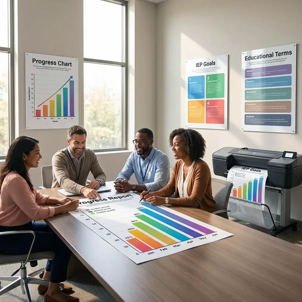
• Left-to-right flow only • One activity per visual block • Consistent time markers • Removable elements for changesMeasuring Success: Real Classroom Impact
Data from 3-month pilot program across 5 classrooms using sensory-smart poster design principles
Common Mistakes to Avoid
Even well-intentioned teachers can inadvertently create sensory challenges. Here are pitfalls I’ve observed and how to avoid them:
The “Rainbow Explosion” Trap Using every color in your color poster maker machine might seem engaging, but it overwhelms sensitive nervous systems. Instead, choose one accent color per learning objective. This creates visual interest without chaos.
Font Variety Overload Multiple fonts force the brain to decode different letter shapes, exhausting neurodiverse learners. Stick to one font family throughout your classroom. I recommend Lexend Deca, specifically designed for readability.
Pattern Backgrounds That cute polka-dot border? It’s competing with your content for visual attention. Solid colors or subtle gradients provide structure without distraction.
Inconsistent Placement When posters move locations frequently, students lose their visual anchors. Designate specific wall spaces for different poster types and maintain consistency throughout the year.
Tools and Resources for Implementation
Creating sensory-smart posters becomes effortless with the right tools. The cost per print for these specialized materials averages just $1.50—a small investment for significant impact. Here’s what I recommend:
Hardware Solutions For maximum flexibility, consider the Education Flex 30, which prints and cuts custom shapes. This allows you to create visual supports in formats that reduce rectangular monotony—think cloud-shaped calm-down cards or hexagonal subject labels.
Design Support Don’t go it alone! The lifetime design service includes consultations on sensory-friendly layouts. Their human designers understand neurodiversity needs better than AI-generated templates ever could.
Material Selection Choose coated poster paper with matte finish for everyday displays. This reduces glare while maintaining color vibrancy—essential for maintaining visual consistency across your sensory-smart system.
Parent Partnership: Extending Sensory-Smart Design Home
Consistency between school and home multiplies the benefits of sensory-smart design. Share these strategies with families:
Home Visual Schedule Templates Provide parents with digital files matching your classroom’s visual schedule design. When morning routines use the same calm blue backgrounds and spacing at home and school, transitions become smoother. The 5-year warranty on school printers means you can support families long-term.
Weekend Social Stories Create visual narratives for challenging situations like grocery shopping or doctor visits. Use your established color coding: green for “expected,” yellow for “unexpected but okay,” red for “time to use coping strategies.”
Survey data from 127 families using coordinated visual supports
Your Next Steps
Creating neurodiverse learning landscapes doesn’t happen overnight, but small changes yield significant results. Tomorrow, try this: Choose one classroom poster and redesign it using our five-step process. Reduce colors, increase white space, and test with your most sensitive learners.
Remember Maya from our opening story? After implementing sensory-smart design principles, she now enters her classroom with confidence. The visual environment supports rather than overwhelms her. Her academic performance improved, but more importantly, she feels safe and ready to learn.
The best poster printer for neurodiverse learning isn’t just about technology—it’s about intentional design that honors all learning styles. Whether you’re creating visual schedules, subject posters, or behavior supports, these principles ensure every student can access and benefit from your visual teaching tools.
Share your sensory-smart classroom transformations with me! Email photos of your redesigned spaces, and I’ll feature the most innovative approaches in next month’s newsletter. Together, we’re building learning environments where every child thrives.
Download my free Sensory-Smart Poster Template Pack below and start transforming your classroom today!
Ready to Color-Code Your Successful Classroom Space?
Start creating sensory-smart learning environments today!