The Do’s and Don’ts of Poster Design for Schools is an essential guide for educators, administrators, and anyone looking to create captivating educational visuals. Posters can transform a classroom into a vibrant, student-centered environment, but the process of designing them isn’t always straightforward. In this article, we’ll provide detailed tips to help you craft effective posters and highlight potential pitfalls to avoid. By following these guidelines and leveraging Poster Making Machines and large format printing solutions, you can create engaging, high-quality posters that reinforce your teaching objectives.
Why Poster Design Matters in Schools
Posters play a significant role in schools for several reasons. First, they serve as eye-catching aids that help students absorb information more readily. Second, they create a stimulating visual environment, fostering excitement and curiosity about various subjects. Lastly, by adhering to The Do’s and Don’ts of Poster Design for Schools, educators can ensure these classroom visuals remain both educational and appealing.
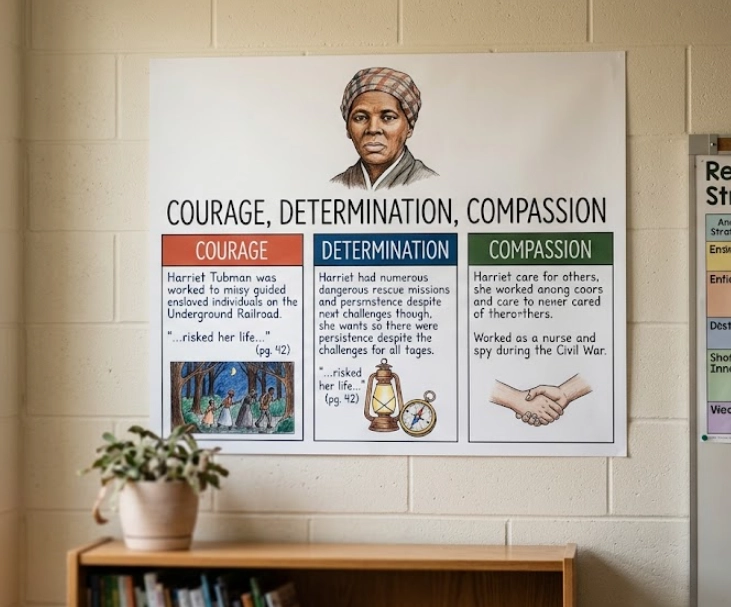
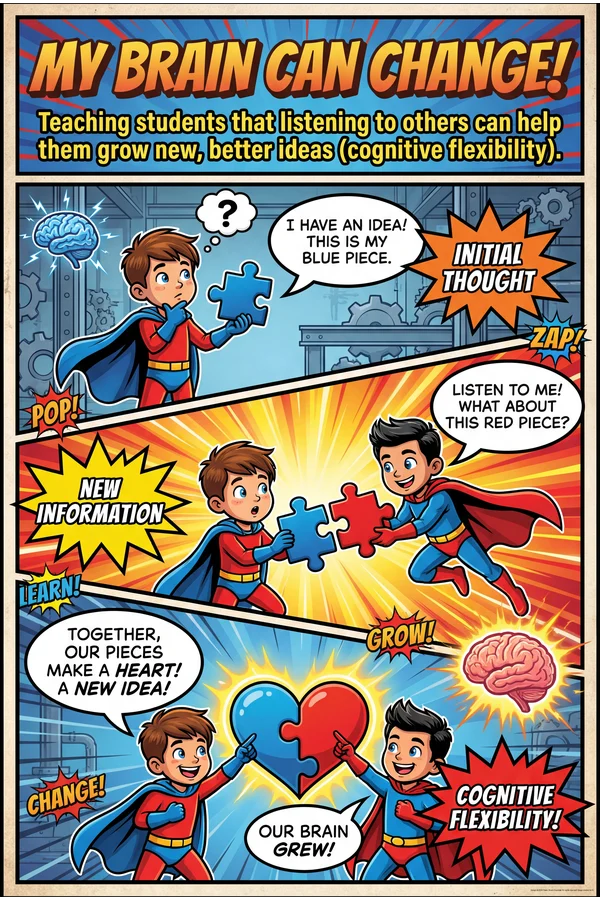
Enhancing Learning with Visual Aids
Studies suggest that students often learn more effectively with a combination of verbal and visual materials. A well-designed poster can highlight critical concepts, reinforce vocabulary, or showcase historical timelines. For more comprehensive insights on how visuals can boost student engagement, consider visiting the National Education Association (NEA) for additional resources on educational design and learning strategies.
The Do’s of Poster Design
-
Start With a Clear Purpose
When following The Do’s and Don’ts of Poster Design for Schools, begin by identifying the main goal. Is your poster meant to inform, persuade, or simply decorate the classroom? Clarifying your purpose from the outset helps guide design decisions such as text, imagery, and layout. -
Use High-Resolution Images
Blurry or pixelated graphics can distract from your message and lower the professional quality of your poster. Ensure you’re sourcing high-resolution images that will remain sharp, especially when printed through Poster Studio Express on large formats. -
Prioritize Legible Fonts
A font that looks gorgeous up close may be difficult to read from the back of a classroom. Stick to clean, simple typefaces like Arial, Verdana, or Helvetica, and keep your font size large enough to be legible from a distance. -
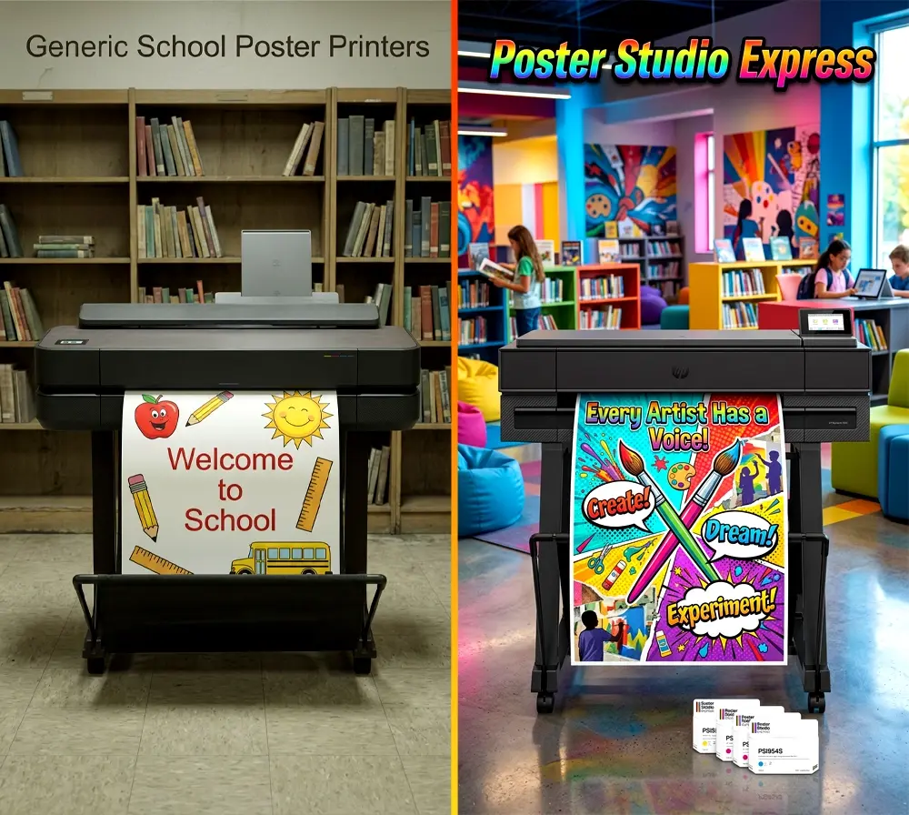
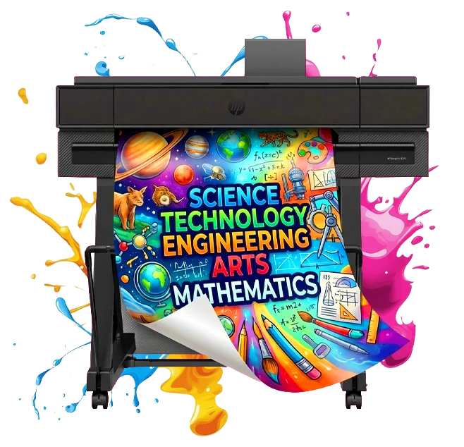
Invest in Quality Equipment
Using Poster Making Machines designed for schools can make a significant difference in your final product. High-quality printing ensures colors remain vibrant and text stays crisp. For reliable large format solutions, explore the Large Format Poster Printers for Schools available at PosterStudioExpress.com. -
Incorporate Ample White Space
White space, or negative space, refers to the blank areas around your design elements. This breathing room helps maintain clarity and directs a viewer’s attention to the essential information.
The Don’ts of Poster Design
-
Don’t Overcrowd Your Layout
An overly busy poster can be just as ineffective as a poorly designed one. When applying The Do’s and Don’ts of Poster Design for Schools, remember that minimalism can be more impactful. Too many graphics, excessive text, or cluttered backgrounds can overwhelm students instead of engaging them. -
Don’t Neglect Proofreading
A simple grammar or spelling mistake might seem minor, but it can undermine your poster’s credibility. Always proofread multiple times before printing to avoid last-minute errors. -
Don’t Forget About Contrast
If your text and background colors are too similar, the message can fade into the backdrop. Ensure enough contrast so that the key points stand out. For instance, dark text on a light background or vice versa will typically be easier to read. -
Don’t Rely Solely on Text
While text is crucial, it shouldn’t be the only focus. Strive for a balance between textual content and visual elements, like graphics and charts, to maintain your audience’s interest. -
Don’t Skip Feedback
Whether it’s from students, colleagues, or administration, feedback is invaluable. Fresh eyes can catch design or content oversights you might miss on your own, making your final poster even more effective.
Practical Tips for Better Poster Printing
-
Experiment With Test Prints
Before committing to printing multiple copies, run a small test print to check for any issues in layout, color, or readability. This step can save you time and resources in the long run. -
Choose the Right Paper Stock
Thicker paper or special poster stock will result in sturdier, longer-lasting prints. Consider the environment in which the poster will be displayed (e.g., indoors vs. outdoors) and choose materials accordingly. -
Use Poster Making Machines Efficiently
Speed, reliability, and ease of use are critical features of Poster Making Machines in an educational setting. By selecting equipment with user-friendly software, you can streamline your workflow and produce professional designs even with basic technical knowledge.
Conclusion
Implementing The Do’s and Don’ts of Poster Design for Schools can significantly impact how students engage with classroom materials. From choosing clear fonts and vibrant images to maintaining a clutter-free layout, these best practices ensure your posters effectively support and enhance learning. Couple these design principles with Poster Making Machines from Poster Studio Express to produce high-quality, large format displays that truly elevate your classroom environment. By taking the time to plan, proof, and polish your poster designs, you’ll create lasting, visually appealing educational tools that benefit every student who walks through your door.