
No Design Degree? No Problem!
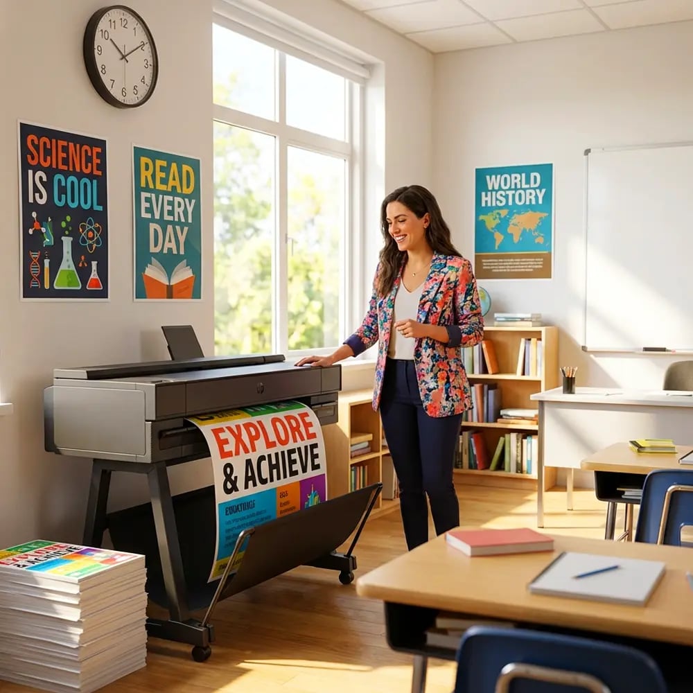
Picture this: It’s Tuesday afternoon, and you need eye-catching posters for tomorrow’s science fair. Your poster print machine simple layouts knowledge feels as empty as that blank canvas staring back at you.
But here’s a secret from my art room: professional-looking posters don’t require an MFA. After watching countless teachers struggle with design software, I’ve discovered that the most effective layouts follow simple, repeatable formulas. These work whether you’re using a poster print machine or crafting by hand.
Last week, Ms. Rodriguez from the math department stopped by my classroom, nearly in tears. “I spent three hours on this poster, and it still looks like a ransom note!” she said, holding up a chaotic mix of fonts and colors. Twenty minutes later, using the rule of thirds and two complementary colors, she’d created something that made other teachers ask, “Did you hire a designer?”
That transformation happens daily in my workshops. Teachers discover that great design isn’t about artistic talent—it’s about following proven formulas that guide the eye and enhance understanding.

Poster Print Machine Simple Layouts: The Rule of Thirds
Imagine your poster divided by two horizontal and two vertical lines, creating nine equal sections. This ancient composition principle, borrowed from Renaissance painters, transforms amateur layouts into professional designs instantly.
Place your most important elements where these lines intersect—we call these “power points.” Your title might stretch across the top third, while key images anchor the intersection points. This creates natural flow and prevents that dreaded “floating in space” look.
For educational content, I recommend this distribution:
– Top third: Title and main concept
– Middle third: Supporting visuals or key points
– Bottom third: Details, instructions, or call-to-action
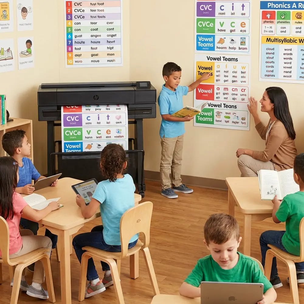
When using your school’s banner printing machine, this grid becomes even more crucial. Larger formats amplify design mistakes, but the rule of thirds scales beautifully from 8.5×11 to massive hallway displays.
Color Combo #1
Navy + Yellow GoldOcean & Sunshine
Perfect for science and math content. High contrast ensures readability from across the classroom.Color Combo #2
Deep Green + Soft PinkForest & Coral
Calming yet engaging. Ideal for reading corners and quiet work areas.The Science of Color Selection
Research from the University of British Columbia shows that certain color combinations can improve information retention by up to 78%. But here’s what they don’t tell you: it’s not about using every crayon in the box.
My foolproof formula uses just three colors:
1. Primary color (60%): Your background or dominant shade
2. Secondary color (30%): Headers and important elements
3. Accent color (10%): Call-to-action or emphasis points
This 60-30-10 rule prevents visual chaos while maintaining interest. For diverse learners, especially those with dyslexia or color vision differences, I recommend testing your combinations with online accessibility checkers.
Typography That Speaks to Every Learner
Font pairing terrified me until I discovered this simple truth: contrast creates clarity. Pair a decorative header font with a clean body font, and magic happens.
My go-to combinations for educational posters:
– Comic Sans MS + Arial: Yes, Comic Sans! Perfect for elementary learners
– Fredoka One + Open Sans: Playful yet professional
– Montserrat + Lato: Modern and highly readable
The key? Never use more than two fonts per poster. Your poster print machine will thank you, and so will your students’ eyes.
For students with reading differences, sans-serif fonts at 18pt or larger work best. Letter spacing of 1.2x improves readability for everyone, not just struggling readers.
Poster Print Machine Simple Layouts in Action
Retention increase with visual hierarchy
Teachers report improved confidence
Time saved using templates
Before & After: Real Classroom Transformations
Last month, third-grade teacher Mr. Chen shared his multiplication poster disaster. “I used seven different colors and four fonts,” he laughed. “It looked like a unicorn exploded.”
Using our simple layout formula, he recreated the poster in 15 minutes:
1. Grid it: Applied rule of thirds
2. Color it: Navy background, yellow headers, white text
3. Font it: Fredoka One for title, Open Sans for content
4. Space it: 40% white space minimum
The result? Students actually asked to study from it. One parent even requested a copy for home practice.
These transformations happen because good design removes barriers to learning. When information flows logically and colors guide rather than distract, comprehension soars.
Your Design Toolkit Awaits
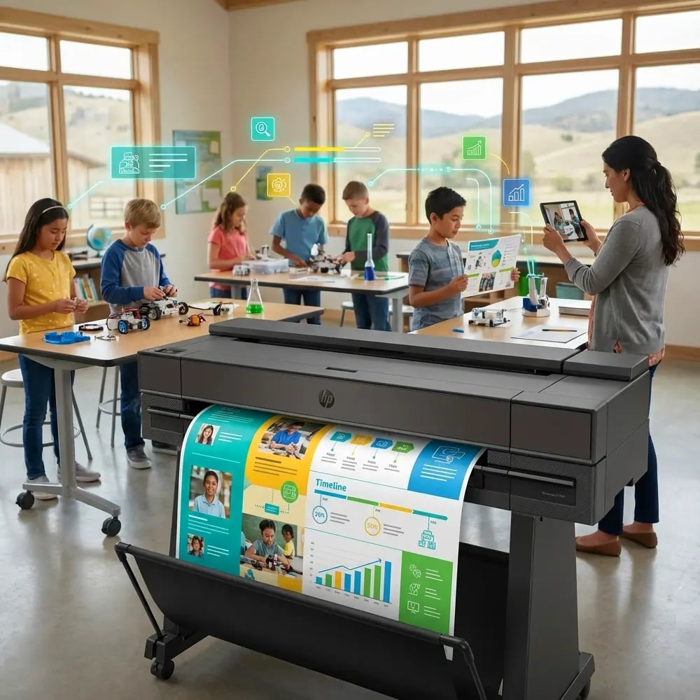
Ready to transform your poster game? I’ve created a comprehensive cheat sheet that fits perfectly next to your banner printing machine. It includes color swatches, font pairings, and layout grids that work every single time.
Adapting Layouts for Different Subjects
Each subject deserves its own visual language. Science posters thrive with diagrams in the golden ratio positions. History timelines flow beautifully along the horizontal thirds. Math concepts pop when equations occupy power points.
For language arts, I love using the Z-pattern layout. Readers naturally scan from top-left to top-right, then diagonally down to bottom-left, finishing at bottom-right. Place your hook at the start and your call-to-action at the end.
Special education requires extra consideration. Increase white space to 50%, use symbols alongside text, and maintain consistent layouts across related posters. This predictability reduces cognitive load and increases comprehension.
Quick Design Fixes for Common Mistakes
Problem: Text floating in corners
Solution: Anchor to grid lines or center within thirds
Problem: Colors that vibrate against each other
Solution: Add a neutral buffer (white or gray border)
Problem: Important info gets lost
Solution: Size hierarchy – make key points 2x larger
Problem: Too many focal points
Solution: One hero element per poster
Problem: Fonts fighting for attention
Solution: Stick to the two-font maximum rule
Problem: Cramped, busy layouts
Solution: Remove 30% of content – less is more
Your Creative Journey Starts Now
Great design isn’t about talent—it’s about following proven formulas that work. Whether you’re creating a single classroom poster or running hundreds through your school’s poster print machine, these simple layouts guarantee professional results every time.
Start with one poster. Apply the rule of thirds. Choose three colors. Pick two fonts. Watch as your colleagues ask, “Where did you learn to design like that?”
Then smile and share these secrets. Because when teachers feel confident creating visual materials, students benefit. And that’s the most beautiful design of all.