working comfortably in a")

Districts nationwide are discovering that strategic visual design transforms special education environments from overwhelming spaces into supportive learning sanctuaries. Through evidence-based approaches to sensory-smart poster creation, schools report dramatic reductions in student distress while enhancing academic engagement. This comprehensive guide examines how a poster maker for school neurodiversity becomes an essential tool for creating inclusive visual environments that honor diverse neurological needs.
Understanding the Sensory Impact of Visual Environments
Research from the Journal of Autism and Developmental Disorders demonstrates that environmental factors significantly influence learning outcomes for neurodiverse students. Visual clutter, harsh contrasts, and overwhelming color schemes can trigger sensory overload, leading to decreased attention and increased behavioral challenges. Conversely, thoughtfully designed visual supports enhance processing speed and reduce cognitive load.
The concept draws inspiration from “The Breakfast Club Effect” – acknowledging that every brain processes information differently. Just as the film’s diverse characters each brought unique perspectives, neurodiverse learners require personalized visual environments. Modern educational research confirms that one-size-fits-all classroom design fails to serve students with autism, ADHD, dyslexia, or sensory processing differences.
Dr. Temple Grandin’s groundbreaking work on visual thinking highlights how many autistic individuals process information primarily through images rather than words. This neurological difference transforms poster design from aesthetic choice to educational necessity. Similarly, students with ADHD often benefit from visual anchors that provide external structure for executive function challenges.
Color Psychology Research for Autism and ADHD
Evidence-based color selection dramatically impacts neurodiverse learners’ ability to process information. A 2019 study from Environment and Behavior revealed specific color frequencies that either enhance or impair focus for students with autism spectrum conditions.
Calming Color Palettes for Sensory Regulation
Research indicates that muted, natural tones reduce sensory overwhelm while maintaining visual interest. Soft blues (wavelength 450-495 nm) promote calm focus without inducing drowsiness. Sage greens connect to nature’s regulatory effects, while warm grays provide neutral backgrounds that don’t compete for attention. These findings guide educators using a Education Express 24″ Poster Maker Package A to create supportive visual materials.
Avoiding sensory triggers proves equally important. Fluorescent yellows, electric oranges, and high-contrast patterns can overwhelm sensitive nervous systems. Research documents increased cortisol levels in autistic students exposed to visually chaotic environments. Strategic color selection becomes therapeutic intervention rather than mere decoration.
ADHD-Specific Visual Strategies
Students with ADHD require different visual approaches than autistic learners. While autism often involves sensory sensitivity, ADHD typically presents as sensory-seeking behavior. Controlled use of strategic accent colors can anchor attention without overwhelming. Research supports using single bright elements against neutral backgrounds to create focal points that combat distractibility.
The Lifetime Design Service helps educators translate these research findings into practical classroom materials. Professional designers understand how color saturation levels impact different neurological profiles, creating customized visual supports that enhance rather than hinder learning.
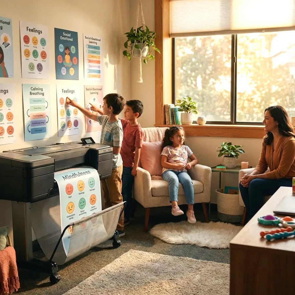
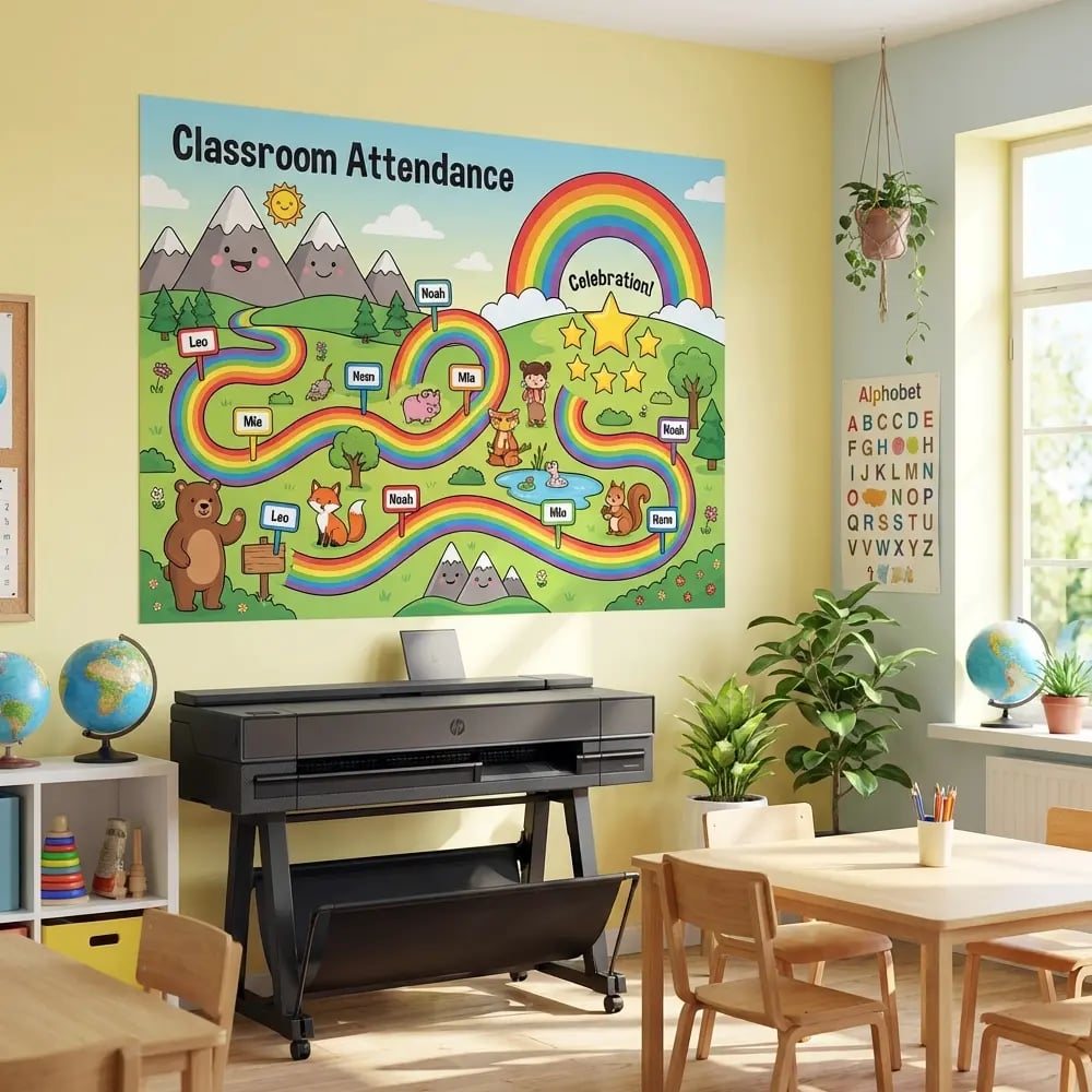
Creating Visual Schedules That Actually Work
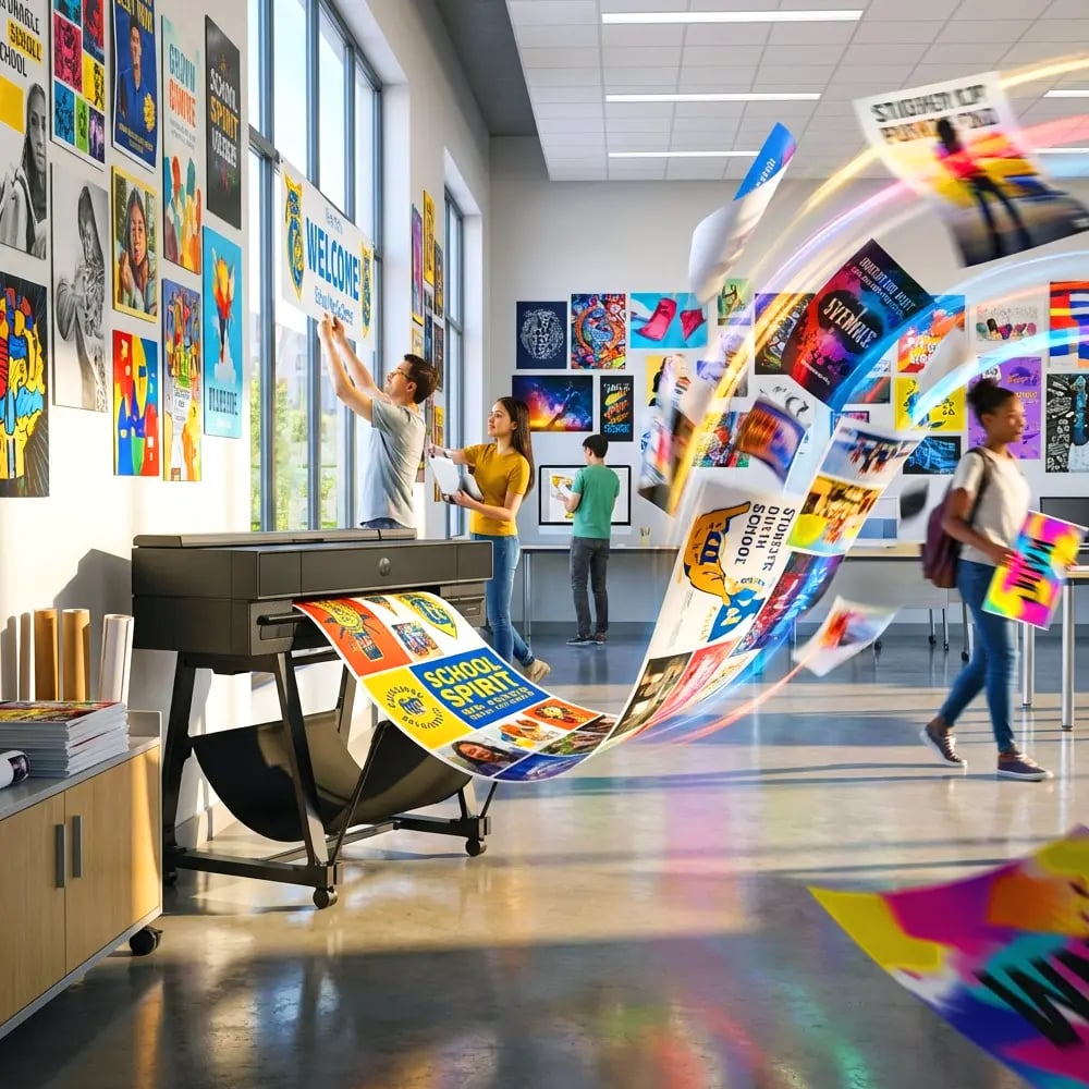
Traditional visual schedules often fail because they ignore fundamental principles of information processing for neurodiverse learners. Effective schedules require careful attention to hierarchy, spacing, and symbolic representation. Districts investing in a poster maker machine for schools cost analysis find that producing customized schedules in-house dramatically improves their effectiveness.
Evidence-Based Schedule Design Principles
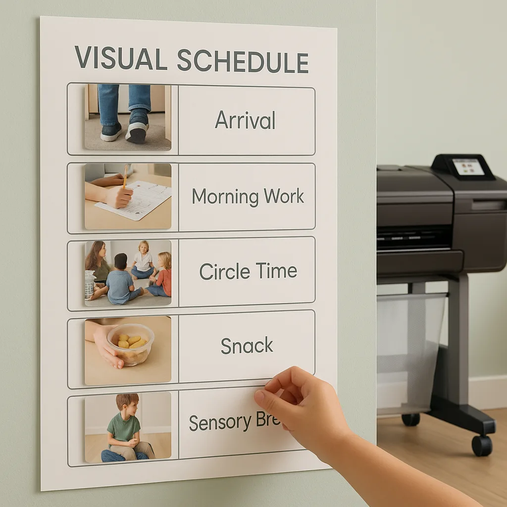
Successful visual schedules incorporate consistent iconography that transcends language barriers. Research from special education journals emphasizes using realistic photographs or simple line drawings rather than cartoon representations. This clarity reduces cognitive translation demands, allowing students to quickly process sequential information.
Spacing proves critical for preventing visual overwhelm. The “white space ratio” should exceed 40% of total poster area, providing visual breathing room. Each schedule element requires clear boundaries through subtle color blocking or thin borders. These design principles apply whether creating daily schedules, choice boards, or behavioral expectation charts.
Flexibility within structure addresses individual processing speeds. Moveable schedule components allow real-time adjustments while maintaining predictable frameworks. Schools using the Education Studio 36″ Poster Maker Package A+ report creating durable, wipeable schedules that withstand daily manipulation while maintaining professional appearance.
Case Studies: Measurable Impact Through Environmental Design
Compelling evidence emerges from districts systematically implementing sensory-smart visual design. These real-world applications demonstrate how strategic poster use transforms educational outcomes for neurodiverse populations.
Case Study 1: Reducing Meltdowns Through Visual Structure
Riverside Elementary in California documented a 60% reduction in behavioral incidents after implementing comprehensive visual support systems. Their approach began with environmental assessment, identifying sensory triggers throughout special education spaces. Using data-driven design principles, they created calming visual anchors in transition areas where meltdowns frequently occurred.
The intervention included color-coded zones matching sensory needs: blue “calm-down” corners with minimal visual stimulation, green “ready-to-learn” spaces with moderate structure, and controlled yellow “choice time” areas for preferred activities. Each zone featured coordinated posters created with their poster maker for school neurodiversity initiatives, ensuring consistent visual language across environments.
Quantitative data collection revealed decreased time-to-regulation during distress episodes. Qualitative feedback from paraprofessionals noted improved student self-advocacy, with learners independently seeking appropriate sensory zones based on internal states. This environmental scaffolding reduced adult intervention needs while building self-regulation skills.
Case Study 2: Enhancing Communication Through Visual Supports
A Texas district serving high percentages of non-speaking autistic students revolutionized their augmentative communication approach through strategic poster deployment. Rather than relying solely on individual communication devices, they created environmental communication boards throughout learning spaces.
Core vocabulary posters strategically placed at student eye level enabled spontaneous communication opportunities. The district’s investment in a poster maker machine for schools cost analysis revealed significant savings compared to purchasing pre-made materials that didn’t match their specific student needs. Customization allowed culturally relevant imagery and bilingual supports for their diverse population.
Teachers reported 40% increases in student-initiated communication within six months. Parents noted generalization of communication strategies at home, requesting similar visual supports for domestic environments. The district now provides 5 Year Next Business Day Warranties poster templates to families, extending inclusive design beyond school walls.
Implementation Strategies for Your School
Translating research into practice requires systematic planning and stakeholder buy-in. Successful implementation begins with comprehensive needs assessment, identifying specific sensory challenges within your neurodiverse population. This data drives design decisions, ensuring visual supports address actual rather than assumed needs.
Building Your Sensory-Smart Poster System
Start with high-impact areas where visual supports provide immediate benefit. Transition spaces, where students move between activities, often trigger dysregulation. Create consistent visual cues that preview upcoming changes while providing regulation strategies. These transitional supports might include breathing technique reminders, sensory break options, or visual countdowns.
Classroom entry points benefit from visual boundaries clearly delineating different zones. Use floor markings coordinated with wall posters to create coherent spatial organization. Students with autism particularly benefit from predictable environmental structures that reduce processing demands during transitions.
Individual work areas require personalized visual supports matching specific learning profiles. Some students need minimal visual input to maintain focus, while others benefit from structured visual schedules and behavioral reminders. The flexibility of in-house poster creation allows rapid iteration based on student response.
Technology integration enhances static visual supports. QR codes on posters can link to calming music, video demonstrations, or communication apps. This multi-modal approach addresses diverse learning preferences while maintaining clean visual design. Schools find the Demo Video helpful for training staff on these advanced features.
Measuring Success: Data-Driven Visual Design
Effective implementation requires ongoing assessment of visual support impact. Establish baseline data before introducing new poster systems, tracking relevant metrics like behavioral incidents, task completion rates, or communication frequency. This quantitative foundation enables objective evaluation of design effectiveness.
Collect qualitative feedback from students, when possible, about their visual environment preferences. Many neurodiverse learners can articulate specific sensory needs when provided appropriate communication formats. Staff observations provide additional insight into which visual supports students spontaneously utilize versus those requiring adult prompting.
Regular design iteration based on collected data ensures visual supports remain effective as student needs evolve. What works for elementary students may require modification for adolescents. Similarly, individual sensory profiles can shift with development, medication changes, or therapeutic interventions. The cost-effectiveness of in-house poster creation enables responsive design modifications without budget constraints.
Professional Development for Sensory-Smart Design
Educator training transforms theoretical knowledge into practical application. Professional development should encompass both neurodiversity awareness and technical design skills. Understanding why certain colors or layouts impact neurodiverse learners empowers teachers to make informed design decisions.
Hands-on workshops using poster creation tools build staff confidence in producing customized materials. Many educators initially feel intimidated by design software, but intuitive interfaces and available templates simplify the process. Schools report that Drag and Drop Printing From Canva particularly resonates with teachers familiar with that platform.
Collaborative design sessions foster shared ownership of visual environments. When general education teachers, special educators, occupational therapists, and speech pathologists jointly create visual supports, the resulting materials address multiple therapeutic goals simultaneously. This interdisciplinary approach maximizes the impact of each poster while building team cohesion.
Future Directions: Universal Design for Learning
The principles underlying sensory-smart poster design extend beyond special education settings. Universal Design for Learning recognizes that supports benefiting neurodiverse students often enhance learning for all students. Clear visual organization, predictable structures, and calming color palettes create optimal learning environments regardless of neurological profiles.
Emerging research explores how culturally responsive visual design intersects with neurodiversity support. Students navigating both neurological differences and cultural transitions benefit from visual supports reflecting their full identities. This intersectional approach to poster design promotes belonging while addressing learning needs.
As understanding of neurodiversity expands, visual support sophistication increases correspondingly. Future developments may include dynamic digital posters responding to biometric data, adjusting color or content based on stress indicators. However, current evidence strongly supports immediate implementation of research-based static visual supports using available poster-making technology.
Schools committed to inclusive education recognize environmental design as fundamental to student success. By investing in a poster maker for school neurodiversity initiatives, districts provide educators with tools to create truly inclusive learning environments. The measurable outcomes – reduced behavioral challenges, enhanced communication, and improved academic engagement – justify both the financial investment and ongoing professional development required for implementation.
The “Breakfast Club Effect” reminds us that every brain brings unique gifts to our learning communities. Through thoughtful visual design grounded in research and responsive to individual needs, we create spaces where all students can thrive. This transformation requires more than good intentions; it demands systematic implementation of evidence-based practices, ongoing data collection, and commitment to continuous improvement. The tools now exist to make these inclusive environments reality – the question becomes not whether to implement sensory-smart visual design, but how quickly we can bring these benefits to our neurodiverse learners.