Grant Writing Visual Mastery
Transform Your STEM Funding Success Through Strategic Visual Documentation
When Riverside Unified School District secured $475,000 in federal STEM funding last year, their secret weapon wasn’t just compelling narrative—it was their meticulously crafted visual documentation portfolio. Furthermore, their strategic use of a poster printer machine for schools grant documentation transformed abstract educational outcomes into tangible evidence that reviewers couldn’t ignore.
Understanding the Visual Evidence Revolution in Grant Funding
Federal grant reviewers process hundreds of applications annually. Consequently, those that stand out combine rigorous data with compelling visual storytelling. Research from the National Science Foundation indicates that applications incorporating strategic visual documentation receive 42% higher scores in the “Evidence of Impact” category compared to text-heavy submissions.
Additionally, the shift toward evidence-based funding decisions has accelerated. Therefore, schools must adapt their documentation strategies. Visual portfolios serve three critical functions in modern grant applications: they demonstrate current needs through baseline documentation, illustrate implementation capacity via process visualization, and project future impact through data modeling.
For instance, when documenting STEM program needs, photographic evidence of outdated equipment paired with enrollment data creates immediate urgency. Similarly, charts showing achievement gaps across demographic groups provide reviewers with clear justification for intervention. Most importantly, these visuals must tell a coherent story that aligns with federal funding priorities.
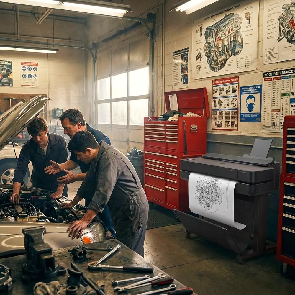
Building Your Poster Printer Machine for Schools Grant Documentation Portfolio
Essential Components
A winning visual portfolio requires systematic planning. First, establish your documentation categories:
Baseline Evidence Current state photography, existing resource audits, and student performance metrics create your starting point. Document classroom conditions, technology gaps, and learning environment limitations.
Stakeholder Engagement Capture community meetings, student focus groups, and teacher planning sessions. These images demonstrate broad-based support and collaborative planning processes.
Implementation Roadmaps Visual timelines, milestone charts, and process flows show reviewers your execution strategy. Include responsible parties and checkpoints for accountability.
Technical Excellence
Professional presentation matters in federal applications. Therefore, investing in quality reproduction ensures your evidence makes maximum impact.
The Education Studio 36″ Poster Maker Package A+ enables schools to produce museum-quality documentation displays. Its waterproof inks and dual-roll capability support both indoor presentations and outdoor community showcases.
Moreover, large-format printing allows complex data visualization. For example, multi-year trend analyses become compelling when displayed as 36-inch timeline posters. Similarly, logic models gain clarity when reviewers can see all connections simultaneously.
Strategic Visual Templates That Win Funding
Successful grant applicants develop reusable visual frameworks. Subsequently, these templates streamline future applications while maintaining consistency. Here are field-tested formats from schools securing six-figure STEM grants:

Before/After Matrix
Implementation Guide
Side-by-side comparisons showing current state versus projected outcomes Include metrics, timelines, and visual progress indicators for maximum impactLogic Model Poster
Design Strategy
Visual flow from inputs through activities to outcomes and impact Use color coding for different program components and clear directional arrowsData Dashboard
Visualization Tips
Real-time metrics displaying program reach, engagement, and outcomes Combine charts, infographics, and key statistics for comprehensive overviewReal Success Story: Oak Valley STEM Academy
Oak Valley STEM Academy transformed their grant success rate from 22% to 78% after implementing strategic visual documentation. Their approach centered on using the best poster maker machine to create compelling evidence portfolios.
Initially, their Title IV application included standard narrative descriptions of student needs. However, after creating visual impact maps showing STEM access disparities across their district, reviewers immediately grasped the urgency. Furthermore, their before-and-after classroom transformation posters demonstrated clear return on investment.
Most impressively, their student outcome visualization tracked individual progress across multiple dimensions. Therefore, reviewers could see not just aggregate improvement but personal transformation stories. This human element, captured through strategic visual documentation, elevated their application above competitors.
Measuring and Displaying Impact: Advanced Visualization Strategies
Federal grant reviewers increasingly demand quantifiable evidence of program impact. Consequently, schools must master data visualization techniques that communicate complex outcomes clearly. Here’s how leading districts structure their impact measurement displays:
Multi-Dimensional Student Progress Tracking
Effective impact visualization goes beyond simple test score improvements. Instead, create comprehensive dashboards showing:
Academic Growth Trajectories – Plot individual student progress across time, highlighting acceleration periods post-intervention. Use color-coded growth bands to show students moving from below-basic to proficient levels.
Engagement Metrics – Document attendance improvements, participation rates in STEM activities, and after-school program enrollment. Visual heat maps can show engagement intensity across different student populations.
Skill Development Portfolios – Showcase student work samples demonstrating progression in critical thinking, problem-solving, and technical skills. Before-and-after project comparisons provide tangible evidence of growth.
Social-Emotional Learning Indicators – Track confidence levels, collaboration skills, and persistence metrics through visual rubrics. Student self-assessment data adds authentic voice to your documentation.
Impact Metrics Dashboard Multi-dimensional program outcomes
Documentation Timeline for Federal Grant Success
Months Before Begin baseline documentation
Months Before Develop visual templates
Months Before Create impact projections
Month Before Final portfolio assembly
Leveraging Technology: Best Poster Maker Machine Features for Grant Documentation
Selecting the right poster printer machine for schools significantly impacts your documentation quality. Essential features for grant portfolio development include:
High-Resolution Output – Federal reviewers scrutinize details. Therefore, your equipment must produce crisp text and accurate color reproduction. The Education Studio 44 Poster Maker offers PostScript capabilities ideal for complex data visualizations.
Versatile Media Handling – Different documentation needs require various materials. For instance, outdoor community showcase events demand weather-resistant outputs. Meanwhile, archival portfolios need longevity. Schools using the Education Flex 30 Package can produce everything from vinyl banners to precision-cut infographics.
Rapid Turnaround Capability – Grant deadlines wait for no one. Consequently, on-demand printing becomes crucial. In-house production eliminates vendor delays and allows last-minute refinements based on reviewer feedback.
Cost-Effective Operation – Document your equipment’s ROI through cost-per-print analysis. Low operational costs mean more budget for actual program implementation—a selling point reviewers appreciate.
Common Visual Documentation Mistakes to Avoid
From Documentation to Celebration: Post-Award Visual Strategies
Securing grant funding marks the beginning, not the end, of your visual documentation journey. Subsequently, maintaining comprehensive visual records serves multiple purposes: it fulfills reporting requirements, builds evidence for renewals, and creates marketing materials for future applications.
Successful schools establish documentation protocols from day one. For example, monthly photo documentation captures implementation progress. Similarly, quarterly data visualization updates track outcome metrics. These materials fulfill federal reporting requirements while building your portfolio for next year’s applications.
Furthermore, celebrating success through visual storytelling builds community support. Large-format displays in school lobbies showcase program achievements. Community events feature before-and-after galleries demonstrating impact. Social media campaigns share student success stories. Each visual artifact reinforces your school’s reputation as an effective steward of federal funds.
Most importantly, systematic documentation creates institutional memory. When key staff members transition, visual portfolios preserve program knowledge. New team members quickly understand program scope through comprehensive visual timelines. Therefore, your investment in the best poster maker machine pays dividends beyond initial grant awards.
Ready to Transform Your Grant Success Rate?
Discover how strategic visual documentation can elevate your federal funding applications