Why Visual Data Displays Matter for School Climate
California schools collect mountains of climate survey data every year. Yet too often, these insights remain trapped in spreadsheets and PowerPoint decks that few stakeholders actually read. Banner printing machines climate data visualization offers a powerful solution, transforming abstract numbers into compelling visual narratives that drive real change.
Research from the National School Climate Center shows that schools using visual data displays see 40% higher engagement in improvement initiatives. When survey results become visible through posters and banners, they move from administrative reports to community conversations. This visibility creates accountability and momentum for positive change.
Consider Lincoln Middle School in Sacramento. After displaying their climate survey results on large-format posters in high-traffic areas, parent participation in school improvement committees jumped from 12 to 47 members within one semester. The visual displays made data accessible and actionable for the entire school community.
Key Climate Survey Metrics to Visualize
Student Safety Perception
Visualize how safe students feel through color-coded heat maps showing different campus areas.
Staff Collaboration
Display collaboration scores using network diagrams that highlight strong and weak connections.
Parent Engagement
Create engagement thermometers showing participation levels across different demographic groups.
Designing Effective Climate Data Posters
Creating impactful climate survey visualizations requires thoughtful design choices. Start by identifying your primary audience—students respond to different visual languages than parents or staff members. Use color strategically to highlight areas needing attention while celebrating successes.
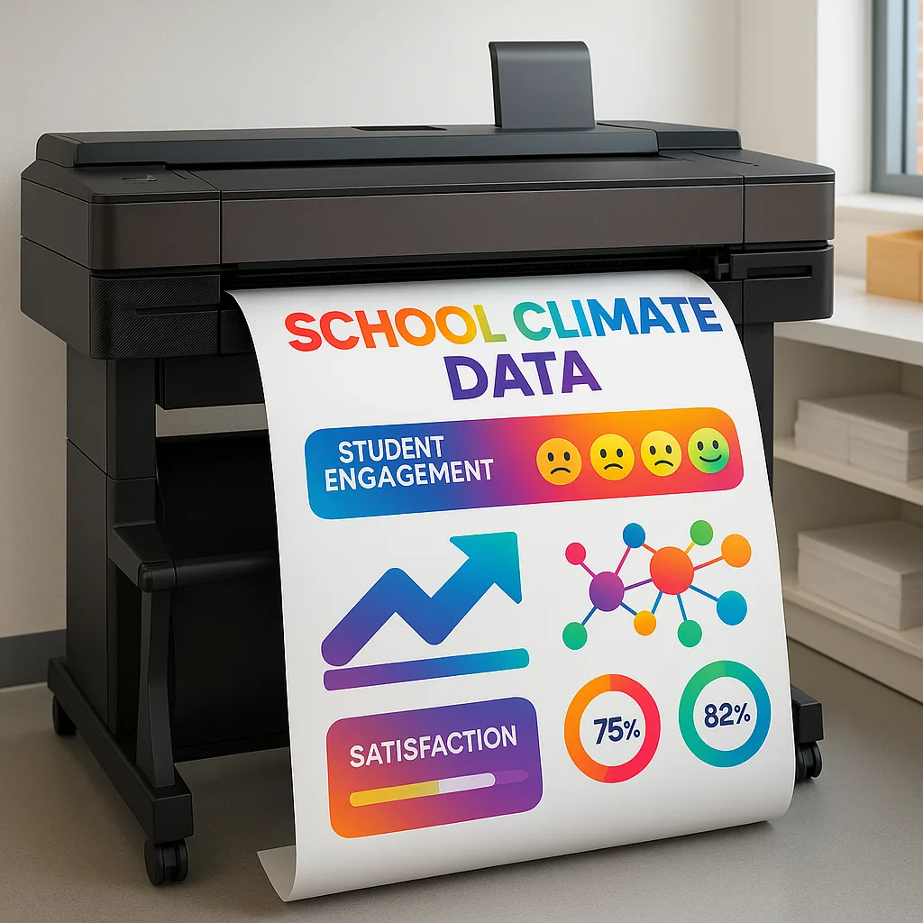
The Education Express 36 Poster Printer provides the ideal canvas for these visualizations. Its 36-inch width allows you to create comprehensive dashboards that display multiple data points while remaining readable from a distance. This visibility ensures your climate data reaches every member of the school community.
Data Visualization Best Practices
Simplify Complex Data: Break down multi-faceted survey results into digestible visual chunks. Instead of presenting raw percentages, use icons or pictographs that instantly communicate meaning. For instance, represent student feelings about safety using emoji-style faces rather than numerical scales.
Create Visual Hierarchies: Lead viewers through your data story by varying element sizes. Make the most critical findings largest and use decreasing sizes for supporting information. This approach guides attention naturally through your poster design.
Use Comparative Displays: Show progress over time using before-and-after graphics or trend lines. These comparisons help stakeholders understand whether initiatives are working and where additional support is needed.
Quick Design Tips
Transform Your Climate Data Today
Ready to turn survey results into action? Our poster maker for school solutions makes it simple to create professional climate data visualizations that engage your entire community.
Banner Printing Machines Climate Data Implementation
Implementing a comprehensive climate data visualization program requires the right tools. Banner printing machines climate data displays offer several advantages over traditional presentation methods. First, they create permanent visual records that can be updated quarterly or annually. Second, their large format ensures visibility in hallways, cafeterias, and community spaces.
The Education Studio 44 Poster Maker excels at producing these large-scale visualizations. With its PostScript capabilities and precision graphics, it transforms complex datasets into compelling visual stories that drive school improvement initiatives forward.
Strategic Placement for Maximum Impact
Main Office Displays: Position overall climate scores and improvement goals where parents and visitors immediately see them. This transparency builds trust and demonstrates commitment to continuous improvement.
Teacher Workrooms: Share staff-specific data including collaboration metrics and professional development needs. These private displays encourage honest reflection and peer support.
Student Commons: Create age-appropriate visualizations focusing on peer relationships, learning environment, and student voice metrics. Interactive elements encourage ongoing feedback.
Library/Media Centers: Display academic engagement data and resource utilization statistics. Link these metrics to available support services and improvement resources.
Community Spaces: Share celebration-worthy achievements and progress toward district goals. Use these displays during parent nights and community events.
Cafeteria Walls: Focus on nutrition program satisfaction and social climate metrics. Make data digestible with fun, food-themed visualizations that engage students during meals.
Moving from Data to Action
Visual displays serve as catalysts for improvement when paired with clear action steps. Each poster should include specific next steps stakeholders can take. For example, if survey data reveals low parent engagement in certain demographics, include QR codes linking to translated resources or meeting schedules in multiple languages.
Create feedback loops by placing comment boxes near displays or digital response options. This ongoing dialogue transforms static data into dynamic conversations about school improvement. Update displays quarterly to show progress and maintain momentum.
Measuring Impact and Iteration
Track how visual displays influence school climate improvement efforts. Document changes in stakeholder engagement, survey participation rates, and actual climate metrics. Schools using our poster maker for school solutions report measurable improvements within one academic year.
Start Your Visual Data Journey
Transforming climate survey data into actionable visual displays doesn’t require design expertise. With our Lifetime Design Service, professional designers help create compelling visualizations tailored to your school’s unique needs and goals. Combined with our reliable printing solutions, you’ll have everything needed to make data drive real change.
Remember, effective climate data visualization goes beyond pretty graphics. It’s about creating conversations, building community buy-in, and celebrating progress while honestly addressing challenges. When stakeholders see their voices reflected in visible displays, they become partners in improvement rather than passive observers.
Take Action Today
Don’t let valuable climate survey insights remain hidden in reports. Transform them into visible catalysts for positive change with professional poster printing solutions designed specifically for schools.


